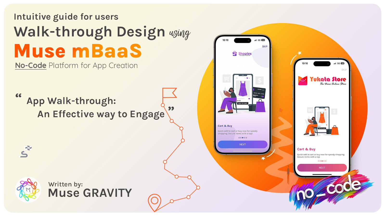
Welcome to our comprehensive guide on app walkthroughs! In today's fast-paced digital world, delivering an outstanding user experience is crucial for the success of any mobile or web application. One of the key components in achieving this is through effective app walkthroughs. But what exactly is an app walkthrough? At its core, an app walkthrough is a user-friendly guide that helps new users navigate and understand the essential features of an app. It's the digital equivalent of a friendly hand-holding experience, guiding users through the app's functionalities and ensuring they get the most out of their app experience from the get-go. Whether you're a developer, a product manager, or simply someone interested in enhancing digital experiences, understanding the nuances of app walkthroughs can significantly impact user satisfaction and retention. So, let's dive in and explore this pivotal aspect of user engagement.
Difference Between App Walkthroughs and Product Tours
When discussing user onboarding and engagement strategies, two terms often come up: app walkthroughs and product tours. While they might seem similar at first glance, they serve distinct purposes in the user experience.
App Walkthrough:
1. In-Depth Guidance :
Walkthroughs offer a step-by-step guide, taking users through specific functionalities of the app.
2. Interactive Learning :
They encourage users to actively engage and perform tasks, enhancing the learning experience.
3. Focused on User Activation :
Walkthroughs aims to familiarize users with key features that are crucial for their active use of the app.
4. Personalized Experience :
They often include user segmentation, providing a tailored experience based on the user's role, needs, or experience level.
5. Goal-Oriented :
Designed to help users achieve specific outcomes and understand how to use the app effectively for their purposes.
Product Tours:
1. High-Level Overview:
Product tours provide a quick introduction to the app, showcasing its overall features and interface.
2. Observational Learning:
They are less interactive, often involving users watching or reading through the tour.
3. Broad in Scope:
Product tours cover a wide range of features without focusing in-depth on specific functionalities.
4. One-Size-Fits-All Approach:
Generally, they are not personalized but offer a standard overview for all users.
5. Introduction to App Environment:
The aim is to give users a feel for the app, its layout, and primary capabilities without detailed guidance on usage.
Understanding these differences is key to effectively employing each tool in enhancing user experience and engagement within your app.
Key Elements of an Effective App Walkthrough
Creating an effective app walkthrough is an art that requires balancing information, engagement, and simplicity. Here are some key elements to consider:
1. Welcoming Start:
Begin with a welcoming screen. This is your first interaction with the user, so make it count. A friendly greeting and a brief introduction to what the user can expect set the tone for the rest of the Walkthrough.
2. User Segmentation:
Not all users are the same, and neither should be your walkthroughs. Segment your users based on their roles, needs, or experience levels. This personalization ensures that each user finds the Walkthrough relevant and engaging.
3. Focus on Activation:
Highlight the core features of your app that deliver the most value. The aim is to guide users towards these key functionalities and help them understand their benefits. This targeted approach not only educates but also motivates users to start using your app actively.
4. Clear and Concise Steps:
Design your Walkthrough to be intuitive and easy to follow. Avoid overwhelming your users with too much information. Break down processes into simple, manageable steps. Think of it as a journey where each step builds on the previous one, leading to a comprehensive understanding of the app.
5. Interactive Learning:
Encourage users to interact with the app as they learn. Interactive elements make the learning process more engaging and memorable. Whether it's clicking through features, entering data, or performing tasks, active participation enhances the learning experience.
Incorporating these elements will not only make your app walkthrough effective but also ensure a pleasant and informative first-time experience for your users. Stay tuned as we delve deeper into designing and optimizing app walkthroughs in the following sections.
Designing Your App Walkthrough: A Step-by-Step Guide
Designing an app walkthrough is a critical process that requires careful planning and execution. Here's a step-by-step guide to help you create an engaging and effective walkthrough for your app:
1. Understand your Audience
Begin by gaining a deep understanding of your target users. What are their needs, main points, and preferences? This knowledge will inform the design of your Walkthrough.
2. Identify Key Features:
Determine the essential features of your app that you want to highlight. Focus on those functionalities that provide the most value to your users.
3. Create a User Flow:
Map out the user journey within your app. This should include the steps users will take during the Walkthrough, from start to finish.
4. Draft your Content:
Write clear, concise, and engaging content for each step of the Walkthrough. Ensure that the language is user-friendly and easy to understand.
5. Design Visually Appealing UI:
The visual aspect of your Walkthrough is crucial. Use attractive graphics, consistent branding, and an intuitive layout to enhance user experience.
By following these steps, you can create a walkthrough that not only educates but also engages your users, leading to a better overall experience with your app.
Optimizing Your App Walkthrough
Once your app walkthrough is designed, testing and optimization are key to ensuring its effectiveness. Here are steps to refine your Walkthrough:
1. Conduct User Testing:
Test the Walkthrough with a group of real users. Observe how they interact with it and note any areas of confusion or difficulty.
2. Gather Feedback:
Collect detailed feedback from test users. Ask specific questions about their experience, what they liked, and what could be improved.
3. Analyze Performance Metrics:
Use analytics tools to track how users interact with the Walkthrough. Look for metrics like completion rates, time spent, and where users drop off.
4. Iterate Based on Insights:
Use the feedback and data gathered to make improvements. This could involve tweaking the content, altering the flow, or changing interactive elements.
5. Regular Updates:
Continuously update the Walkthrough based on new features in your app, user feedback, and evolving user needs.
Testing and optimization are ongoing processes. Regularly revisiting and refining your Walkthrough will ensure it remains effective and relevant.
Crafting App Walkthroughs with Muse mBaaS: No Coding Needed
Creating an intuitive and engaging app walkthrough is crucial for enhancing user experience, especially when introducing new users to your app's features. Muse mBaaS simplifies this process by offering a no-code solution that enables you to design and implement comprehensive app walkthroughs effortlessly. This platform allows you to focus on crafting a user-friendly guide that effectively showcases your app's functionalities without getting bogged down in the complexities of coding. With Muse mBaaS, you can create walkthroughs that are not only informative but also aligned with your app's aesthetic, ensuring a seamless and engaging user experience right from the start.
At Muse mBaaS, we understand the importance of a great first impression. That's why we've made it incredibly simple for you to create compelling app walkthroughs with our no-code platform. Whether you're aiming to boost user engagement, reduce confusion, or highlight key features, Muse mBaaS empowers you to achieve these goals with ease. Say goodbye to coding complexities and hello to smooth, engaging user journeys with Muse mBaaS. After all, a well-guided user is a happy user.
Conclusion:
The creation of an effective app walkthrough is an essential step in enhancing the user experience, particularly for new users navigating your app's features. The distinction between app walkthroughs and product tours, as discussed, highlights the importance of understanding different onboarding strategies and their unique impacts on user engagement. Incorporating key elements such as a welcoming start, user segmentation, focus on activation, clear steps, and interactive learning are crucial for a successful walkthrough. With tools like Muse mBaaS, this process becomes even more accessible, allowing for the creation of comprehensive, user-friendly guides without any coding. By continuously testing and optimizing these walkthroughs, you can ensure they remain effective and relevant, adapting to new features and user feedback. Muse mBaaS stands out as a powerful tool in this realm, offering a no-code solution that simplifies the process and empowers creators to deliver seamless, engaging user experiences. Ultimately, a well-crafted app walkthrough is not just about showcasing app functionalities; it's about creating a smooth, enjoyable journey for the user, leading to increased satisfaction and loyalty.
No Credit Card Required


