Muse GRAVITY
Muse GRAVITY
Be Important, Be Substantive: BE HAPPY

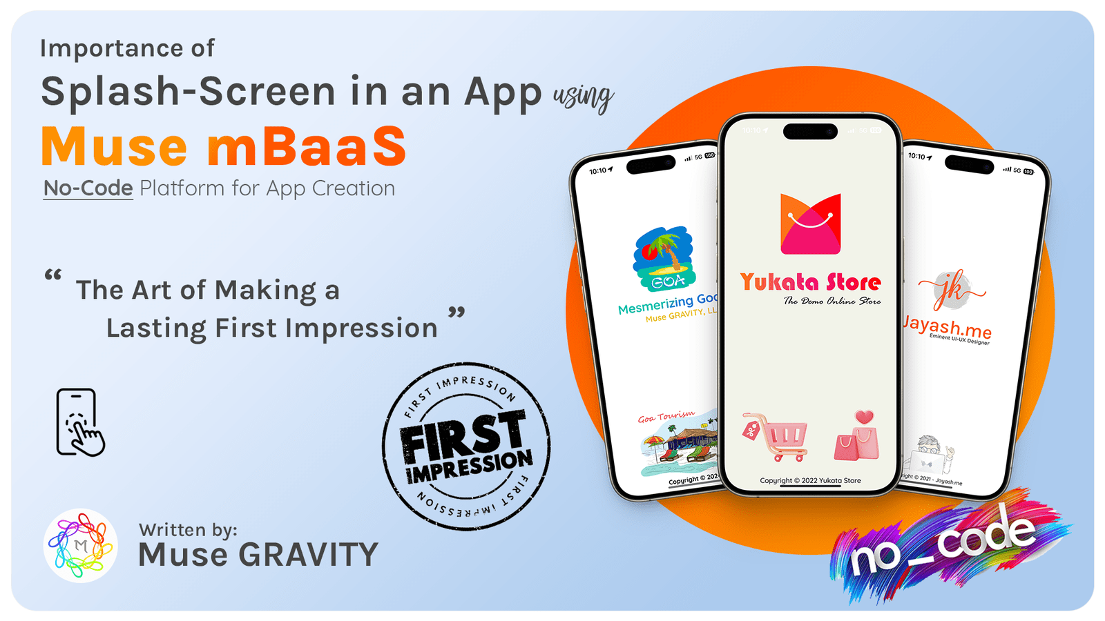
Splash Screens: The Art of Making a long-lasting First Impression

Tuesday, January 02, 2024 08:00:00 By Muse GRAVITY

What is a Splash Screen
Importance of Splash Screen in an App

Imagine launching a mobile app and being greeted not just by functionality but by an experience—an entrance that captivates, intrigues, and promises something more. This is the essence of a well-designed splash screen, the first visual encounter in a mobile app that goes beyond mere aesthetics. It's a storyteller, a brand ambassador, and a strategic tool, laying the foundation for the user's journey within the App. In this digital era, where first impressions can make or break user engagement, the splash screen is not just an introductory page; it's the opening chapter of your App's story, setting the stage for what's to come.


As we dive into the world of splash screens, we uncover their transformative evolution from simple placeholders to powerful branding instruments. A splash screen is like the cover of a book, enticing readers with a hint of the narrative within. This blog aims to unravel the layers of effective splash screen design, exploring how these brief yet impactful visuals can significantly enhance user experience and brand perception. From their psychological impact to practical design tips, we embark on a journey to understand why the splash screen is an indispensable element in capturing and retaining user attention in the fast-paced app universe. Let this be your guide to mastering the art of first impressions in the mobile app world.

The Evolution and Purpose of Splash Screens

The journey of splash screens in the world of mobile apps is a tale of evolution, adapting to the changing landscapes of technology and user expectations. Initially, splash screens emerged as a practical solution to a technical limitation: the loading time. In the early days of computing, when hardware and internet speeds were sluggish, splash screens served as a visual placeholder to engage users while the application loaded in the background. They were simple, often static images or logos, meant to fill the void of waiting time without much thought given to branding or user experience.

As technology advanced, with faster processors and high-speed internet becoming the norm, the functional need for splash screens to mask loading times diminished. However, rather than becoming obsolete, splash screens evolved in their purpose. They transformed into a critical component of the App's branding and user experience strategy. This shift marked a new era where splash screens were no longer just a necessity but an opportunity—an opportunity to make a memorable first impression, to convey brand identity, and to set the tone for the user's journey within the App.
Today, splash screens are an integral part of the app design, serving multiple roles:

1. Branding

A splash screen is often the first point of interaction between the App and the user. It's an opportunity to showcase the brand's logo, colors, and other identity elements, embedding the brand image in the user's mind. https://en.wikipedia.org/wiki/Branding

2. Customer Engagement:

Beyond branding, splash screens are now designed to engage and intrigue users. Whether through captivating animations, enticing imagery, or brief but impactful messages, they aim to create a positive emotional response and anticipation for what's to come in the App. https://en.wikipedia.org/wiki/Customer_engagement

3. Customer Orientation:

For many apps, the splash screen also serves as a moment of orientation, preparing the user for the App's environment. It can set expectations about the App's functionality, theme, or user experience. https://en.wikipedia.org/wiki/Market_orientation

4. Enhancing Customer Experience:

Contrary to the misconception that splash screens are merely for aesthetics, they play a vital role in enhancing overall user experience. A well-designed splash screen can ease the perceived wait time, especially if the App still requires a few seconds to load. https://en.wikipedia.org/wiki/Customer_experience

5. Marketing and Communication:

In some cases, splash screens are utilized for brief marketing messages or communication. This could showcase new features, announcements, or promotional content, although this requires a delicate balance to avoid user annoyance. https://en.wikipedia.org/wiki/Marketing

The future of splash screens continues to evolve with technological advancements. With augmented reality, personalized content, and interactive elements becoming more prevalent, splash screens will likely offer even more immersive and engaging experiences. They stand as a testament to the notion that in the digital world, evolution is constant, and the first point of contact with the user is not just a necessity but an art form in itself.

First Impressions Matter: The Impact of Splash Screens on User Experience:

Much like the grand entrance of a luxury hotel sets expectations, a splash screen establishes the tone for the App. It's a unique opportunity to make a memorable first impression, imprinting your brand identity in the user's mind and preparing them for the journey ahead in your App.

Key Elements of an Effective Splash Screen

An effective splash screen should be quick, typically lasting no more than 3 seconds. It should embody simplicity with a clear and bold design that encompasses your brand's essence. Key elements include an engaging visual, a brief glimpse of the brand identity, and a smooth transition to the main content of the App.

Designing a splash screen requires a delicate balance. It should be visually appealing yet not overwhelming. Use bold colors and simple animations, and ensure that the design aligns with your overall brand image. Including a progress bar can significantly enhance the user's comfort by setting clear expectations for loading times.

Common Pitfalls to avoid in Splash Screen Design

When designing a splash screen, it's crucial to navigate around common pitfalls that can detract from the user experience.

Firstly, excessive duration is a significant misstep. A splash screen should be brief, ideally lasting no more than 3 seconds. Prolonged splash screens can frustrate users eager to access the App's main content​.

Overcomplicated designs are another trap. The splash screen should be simple yet impactful. Intricate designs or too much textual content can overwhelm users in the brief time they have to absorb the screen. The focus should be on delivering a clear, concise message or visual that encapsulates the brand​.

Avoid using splash screens as an advertising space. Users often perceive splash screens with advertisements negatively, as they can come across as a barrier to accessing the App. This usage can erode trust and diminish the perceived value of the App.​

Additionally, inconsistent design is a common error. The splash screen should seamlessly integrate with the overall design and theme of the App. A disjointed design can confuse users and dilute brand messaging.​

Lastly, not optimizing the splash screen for various devices can lead to poor user experiences. A splash screen should look appealing and function well across different screen sizes and resolutions, especially considering the diverse range of mobile devices.​

By avoiding these pitfalls, designers can ensure that the splash screen contributes positively to the user experience, enhancing the App's initial engagement and brand perception.

Innovative Splash Screens with Muse mBaaS: Elevating User Experience

Integrating the concept of effective splash screens into mobile app development reaches new heights with Muse mBaaS (Mobile Backend as a Service). This innovative platform, designed for creating Progressive Web Apps and Native Apps for both Android and iOS, stands at the forefront of user engagement and seamless app development. Muse mBaaS offers a streamlined process where even those without coding skills can develop apps that not only function excellently but also captivate from the first interaction. The platform's intuitive design capabilities allow for the creation of impactful splash screens, ensuring that the first visual users encounter is not only in line with the latest design trends but also resonates with the brand identity and user expectations. By harnessing the power of Muse mBaaS, developers and business owners can craft those crucial first moments of user interaction - the splash screen - to be as compelling and memorable as the App itself, setting the stage for a positive and lasting user experience.

Conclusion:

As we conclude our exploration of splash screens in mobile apps, it's evident that these initial screens are more than just a pretty front. They are the welcoming handshake of an app, the first point of contact that sets expectations and begins the user's journey. This blog shows how splash screens have evolved from basic loading screens to powerful branding and user engagement tools. They're not just about waiting but about making those few seconds count.

The key takeaway is that an effective splash screen blends simplicity, brand identity, and user engagement. It's a balancing act between being visually appealing and not overwhelming the user. We also learned about the common pitfalls to avoid, like making the screen too long or too complex, which can turn users away even before they experience the App.

In this context, Muse mBaaS stands out as a game-changer, especially for those without in-depth coding knowledge. This platform simplifies the process of creating an app, including crafting an engaging splash screen. With Muse mBaaS, anyone can design a splash screen that aligns with the latest trends and effectively communicates their brand message, making that first interaction with users both memorable and enjoyable.

The evolution of splash screens is bound to continue, adapting to new technologies and changing user expectations. However, their significance in shaping the user's first impression of an app remains constant. In the rapidly evolving digital world, where attention spans are short and competition is high, a well-crafted splash screen can distinguish between an embraced app and an overlooked one. This journey through the world of splash screens isn't just about understanding a feature of app design; it's about recognizing the power of first impressions and using it to create a positive and lasting impact on users.
Signup for a FREE Demo

No Credit Card Required

Frequently Asked Questions (FAQ's)
Is it necessary to have a Splash Screen in your Mobile App?
No, having a splash screen in your mobile App is not strictly necessary. While it can enhance user experience by providing a visually appealing introduction and strengthening brand identity, it's not a mandatory feature. The decision depends on the specific needs and goals of your App's design and user engagement strategy.
What is Splash in Mobile App?
A splash screen in a mobile app is an introductory screen displayed briefly as the app loads. Typically featuring the App's logo, brand imagery, or animations, it enhances brand recognition and keeps users engaged during the loading process, setting the tone for the App's user experience.
Why is the Splash Screen called Splash?
The term "splash screen" likely originates from the idea of making a "splash," or a strong, immediate impression on users. It's a metaphor for grabbing attention, much like a literal splash of water makes an immediate impact. This screen aims to engage users the moment they open an app.
Is there any other name for Splash Screen?
Yes, splash screens are also called "launch screens" or "startup screens." These alternative names describe the same concept: a screen that appears when a mobile app is initiated, serving as a brief introduction before the main content of the application is displayed.
Is it easy to create a Splash Screen?
Creating an introductory splash screen can be relatively easy, especially with modern app development tools and platforms like Muse mBaaS that simplify the process. However, designing an effective splash screen that balances aesthetics, brand identity, and user experience can be more challenging and requires thoughtful planning and design skills.